Logo
  • HOME
  • About
  • Portfolio
  • PRESS
  • FAQ
  • Contact
© 2009 - 2020, 79ideas.org
Thursday May 23rd, 2013
radostina
LIFE
9

PRETTY COLOR COMBINATION: GREEN & COPPER

PreviousNext


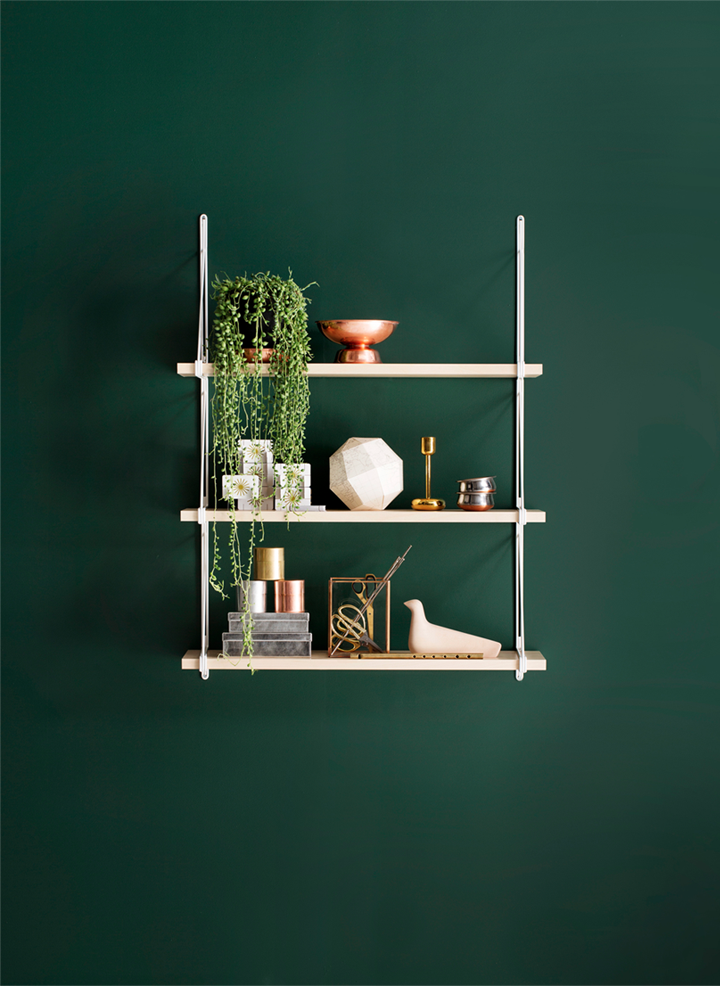
The stunning Finnish stylist Susanna Vento is responsible for my latest color combination crush: dark shades of emerald (pantone color for 2013) and copper.
Oh it is so pretty and I want to see more combinations like that.

photography kristiina kurronen styling: susanna vento 

COLORCOPPERDECORGREENINSPIRATION
Share this

The Author radostina

More Posts Like This One

GORGEOUS PLACE IN MOSCOW

Wednesday April 6th, 2011

OLD CALIFORNIA BY “WIND & BRADFORD”

Friday August 29th, 2014

GREEN IDEAS

Sunday January 10th, 2010

9 Comments

  • Villa Lotta
    Thursday May 23rd, 2013 05:36 AM

    Lovely ideas, I like the colours too very much – Lisa!

    Reply
  • maria ilieva
    Thursday May 23rd, 2013 06:03 AM

    направо ме уцели точно в десятката.зеленото е моят любим цвят.

    Reply
  • Tamara
    Thursday May 23rd, 2013 06:55 AM

    I found your blog and I really love it!
    Follow you ;)
    http://comounaprincesasintonterias.blogspot.com.es

    Reply
  • in2interior NL
    Thursday May 23rd, 2013 07:28 AM

    it gives a green a new face, nice !

    Reply
  • Carolin
    Thursday May 23rd, 2013 12:42 PM

    really inspiring post! i love the colors

    http://desideratum-design.blogspot.com

    Reply
  • Radostina // 79ideas.org
    Thursday May 23rd, 2013 03:56 PM

    thank you tamara. very kind of you.
    hugs,
    radostina

    Reply
  • Radostina // 79ideas.org
    Thursday May 23rd, 2013 03:57 PM

    хаха, радвам се. аз много харесвам комбинацията с мед и тъмно зелено. изключително красиво.
    поздрави,
    радостина

    Reply
  • Radostina // 79ideas.org
    Thursday May 23rd, 2013 03:58 PM

    thank you, carolin. happy that you like it :)
    hugs,
    radostina

    Reply

Leave A Comment Cancel reply

  • ENG
  • БГ

SOCIAL

CATEGORIES

  • ADVICE
  • DESIGN
  • DIY
  • FASHION
  • FOOD
  • HOLIDAY
  • HOME
  • LIFE
  • PERSONAL
  • TRAVEL
  • WEDDING

YOU MIGHT ALSO LIKE

GLIMPSE TO MY TINY WORKSPACE

How important is the workspace for you? Is it messy or you put everything in order at the end of

PHOTOGRAPHY BY JOANNA HENDERSON

These great photos for Coast Magazine are made by the talented Joanna Henderson. Joanna lives and works in London and

A RECIPE FOR COZY INTERIOR

yes, probably there are millions of different guides how to make your home cozier, but mine always includes white base,

GORGEOUS PARISIAN HOTEL

These gorgeous pastel rooms was futured in the latest Lonny magazine from March 2013. Belongs to the beautiful Parisian hotel

FALL-WINTER INSPIRATION BY JOHN LEWIS

The great team Chris Everard (photographer) and Laura Fulmine (styling) have worked together again on the fall-winter catalogue of “John

1/4

INSTAGRAM

Few days ago my favorite film (Fuji 400 H) out of Few days ago my favorite film (Fuji 400 H) out of the blue was discontinued. At first I felt heartbroken - all the countless hours I’ve been spending working on the skin tones, the greens… I named even my dog Fuji. 🐶
Today I have a completely new feelings - the dark mood is replaced with an excitement. Because times changes and we need to adapt to those changes. I’ve always loved the grain of the Kodak Portra and my favorite earth tones looks amazing in it. I guess I’m so ready to start exploring and work even more harder. 
The announcement by Fujifilm actually created a really big buzz and all the film photography community meet in the Clubhouse and we discussed the topic till late at night. 
I pull out one of my all time favorite image photographed on Fuji 400 H. Swan looks amazing here and thank you @richardphotolab for the beautiful scans.
And now it is time for a hard work and more film. Portra film. 
☠️
#artistlife #analogpeople #filmcommunity #clubhouse
Super exciting day today for me. I met a whole bun Super exciting day today for me. I met a whole bunch of new friends on the Clubhouse (do you guys use this new For me, social platform yet, if you are not - check it out and don’t forget to find me 😊) and also I’m so exited to share this photoshoot with you. I usually try to keep my wedding work for @radostina.photography account but this time the images visually implement together two of my favorite styles: wabi sabi and mid century modern with the Earth tones color palette and I just have to share them too. I also was trying to photograph the things differently and more modern instead of classical. I also want to mention the amazing team behind this stunning photoshoot: 
Photographer: @radostina.photography 
Film Lab: @richardphotolab 
Stylist / Planner: @beccawongevents 
Floral Designer: @boughandtwig 
Venue: @viansasonoma 
Cake Designer: @whatsmorecake 
Hair & Make-up Artist: @soyimakeup 
Paper Design: @owlpostcalligraphy 
Videography: @studioarcady 
Model: @divamentality 
Top & Skirt: @alexandragrecco 
Gown: @Ephemerl_ 
Suit: @theblacktux 
Ring: @edenluxebridal 
Ribbons: @partycrushstudio 
Chairs: @TheChiavariGuys 
Linen: @NapaValleyLinens

#radostinabosevaphotography #wabisabiwedding #minimalistwedding #midcenturymodernwedding #filmphotographer

ARCHIVE

CATEGORIES

  • ADVICE
  • DESIGN
  • DIY
  • FASHION
  • FOOD
  • HOLIDAY
  • HOME
  • LIFE
  • PERSONAL
  • TRAVEL
  • WEDDING