Logo
  • HOME
  • About
  • Portfolio
  • PRESS
  • FAQ
  • Contact
© 2009 - 2020, 79ideas.org
Monday June 18th, 2012
radostina
LIFE
11

Summer Inspiration by Julia Hoersch

PreviousNext

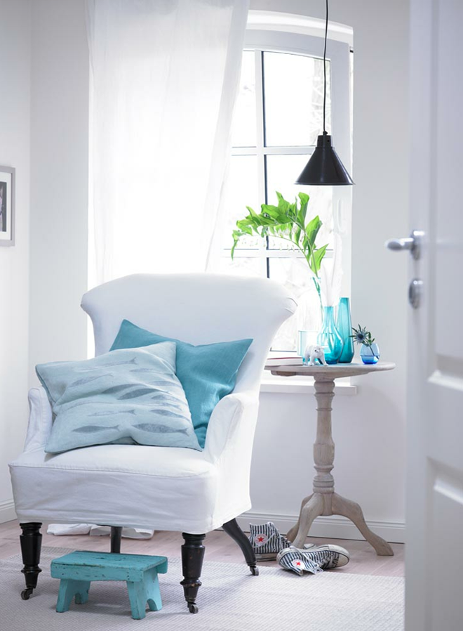
Over a year ago I wrote about the talented photographer Julia Hoersch. She is from those photographers that when you look at their work you can recognized immediately who is the author. Julia has a really clean vision and eye for beautiful details. Very often you can see her in collaboration with another amazing person – the stylist Dietlind Wolf.
Today we can enjoy her blue photosession, I think that it is perfect for the summer.

Преди повече от година писах за талантливата фотографка Julia Hoersch. Тя е от онези фотографи, които в момента, в който погледнете тяхна работа, можете да определите веднага на кого принадлежи. Толкова специфична е тя. Джулия има много чиста визия и око за красивите детайли. Много често можете да видите нейното сътрудничество и с още една изключителна личност – стилистката Диетлинд Уолф. Днес разгледайте тази синя фотосесия, мисля си, че носи чудесно лятно настроение. 

{ images: Julia Hoersch }
Share this

The Author radostina

11 Comments

  • kolora
    Monday June 18th, 2012 11:30 PM

    Exactly the colour palette I chose for our living room this summer! Thanks for more inspiration…and have a nice day! Simone

    Reply
  • minutedeco
    Monday June 18th, 2012 11:47 PM

    I'm becoming a fan of your blog. This aqua colour makes me want to jump in a swimming pool.

    Reply
  • Diana
    Tuesday June 19th, 2012 01:00 AM

    … And I have this colour palette for our bedroom and was looking for assecories in this colour. Thanks!

    Reply
  • Limestone by the Sea
    Tuesday June 19th, 2012 01:47 AM

    Lovely pictures! Wish you a happy day! Victoria

    Reply
  • Lallabel
    Tuesday June 19th, 2012 01:51 AM

    Amazing pics of freshness!

    Reply
  • Sherry
    Tuesday June 19th, 2012 08:58 AM

    Such soothing colors…I can't get enough!

    Reply
  • Kate
    Tuesday June 19th, 2012 11:18 AM

    I can't get over all those blues! They work so beautifully with the neutrals and whites. I love the little details too like the fish shaped chocolates.

    Kate
    http://www.theforgetfulwife.com

    Reply
  • TinaRothwell
    Wednesday June 20th, 2012 12:05 AM

    Oh so beautiful!

    Reply
  • classiq
    Wednesday June 20th, 2012 09:33 AM

    These blues are so calming, these beautiful photos have the effect of a summer breeze. xo
    Ada

    Reply
  • Cathy
    Monday June 25th, 2012 12:46 AM

    Beautifull colorschemes an styling, just like the first post you wrote about Julia, I love her work, thanks for sharing.

    Reply
  • Nani
    Thursday June 28th, 2012 12:21 PM

    Love this blog. Just mentioned your blog on mine this week and posted some of your pics linking them back to you. Thanks for your posts.

    Reply

Leave A Comment Cancel reply

  • ENG
  • БГ

SOCIAL

CATEGORIES

  • ADVICE
  • DESIGN
  • DIY
  • FASHION
  • FOOD
  • HOLIDAY
  • HOME
  • LIFE
  • PERSONAL
  • TRAVEL
  • WEDDING

YOU MIGHT ALSO LIKE

ONE BEDROOM – TWO IDEAS IN DIFFERENT COLORS

The stylist Julia Green together with the photographer Armelle Habib, did a great job for Homelife magazine. They worked in

FEW AUTUMN CRAFT IDEAS

Another wonderful autumn idea I found today in Country Living – old sweaters transformed into clever covers for lampshades, vases,

CHAMRING SMALL APARTMENT IN MOSCOW

Recently I’m definitely surprised by the amount of beautiful… really spectacular apartments, which could be found in Russia. Now I suggest

READY FOR THE AUTUMN IN WHITE, BLACK, GOLD AND WOOD

I think it is time for a little more autumn inspiration. Actually I remembered about this interesting flat, which I

NICELY DECORATED CHRISTMAS HOME

Another beautifully home, carefully decorated for Christmas. Here also we see my favorite  natural decoration with added fresh flowers which

1/4

INSTAGRAM

Time-traveling and salty water. What a perfect way Time-traveling and salty water. What a perfect way to start your Tuesday. 

Santa Monica, California
Contax 645 
Fuji 400 H
@richardphotolab 

If you have a spare moment, jump in on my website... I finally finished redesigning it and finally, I'm proud of the minimal and clean look.

#onfilm #filmphotographic #analoguevibes #believeinfilm #grainisgood
Few days ago my favorite film (Fuji 400 H) out of Few days ago my favorite film (Fuji 400 H) out of the blue was discontinued. At first I felt heartbroken - all the countless hours I’ve been spending working on the skin tones, the greens… I named even my dog Fuji. 🐶
Today I have a completely new feelings - the dark mood is replaced with an excitement. Because times changes and we need to adapt to those changes. I’ve always loved the grain of the Kodak Portra and my favorite earth tones looks amazing in it. I guess I’m so ready to start exploring and work even more harder. 
The announcement by Fujifilm actually created a really big buzz and all the film photography community meet in the Clubhouse and we discussed the topic till late at night. 
I pull out one of my all time favorite image photographed on Fuji 400 H. Swan looks amazing here and thank you @richardphotolab for the beautiful scans.
And now it is time for a hard work and more film. Portra film. 
☠️
#artistlife #analogpeople #filmcommunity #clubhouse

ARCHIVE

CATEGORIES

  • ADVICE
  • DESIGN
  • DIY
  • FASHION
  • FOOD
  • HOLIDAY
  • HOME
  • LIFE
  • PERSONAL
  • TRAVEL
  • WEDDING