Logo
  • HOME
  • About
  • Portfolio
  • PRESS
  • FAQ
  • Contact
© 2009 - 2020, 79ideas.org
Sunday March 3rd, 2013
radostina
LIFE
8

Two Pretty Spring Ideas // Две красиви пролетни идеи

PreviousNext

The coming of the spring always correlates with some change. It starts with the nature and then we change too – we become more energetic, positive and kind. Such a big change usually reflects also on what is around us, in our home. We buy new accessories, home textile and other interesting, beautiful and functional items.

No matter what the current trends are, each spring we observe floral motifs and pastel tones. Here are some ideas how to use them in our home.

If you are caught up in cheerfulness and euphoria maybe you have to pay attention to the flowers. Add more of them in your home in the form of wallpapers, textile or ceramics. If you like to create things by yourself then you can make a decoupage with flowers on some furniture. While you should follow your personal preferences and taste the only rule is: do not exaggerate so you can achieve the desired outcome at the end.

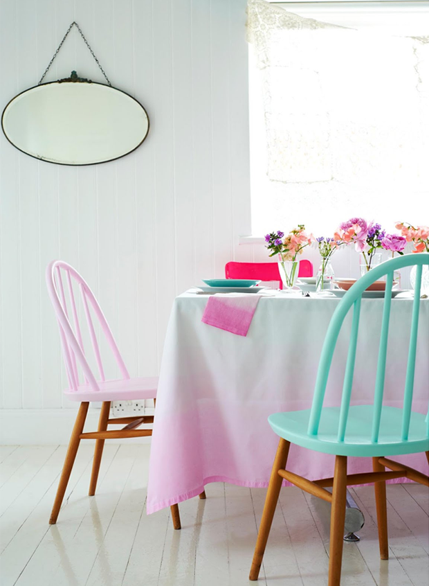
In case the floral motifs are not your cup of tea you can always use pastel colors. They bring fresh and feminine look, when using them everything around shines. This year they could be also in the form of an ombre or geometric patterns.

Настъпването на пролетта винаги се свързва и с повсеместна промяна. Тя започва в природата и постепенно обхваща и нас –  ставаме по-енергични, позитивни и добри. Толкова голямо изменение винаги се отразява и на нашето обкръжение и засяга дома ни, чрез закупуването на нови аксесоари, домашен текстил и други красиви и функционални неща.

Независимо какви са тенденциите за годината, всяка пролет винаги на мода се завръщат флоралните мотиви и пастелните тонове. Ето някои идеи за използването им у дома.

Ако с този сезон ви е обхванала жизнерадост и еуфория, може би трябва да се обърнете именно към цветята. Добавете ги в дома си под формата на тапети, в текстила и керамиката. В случай че обичате да творите сами, направете декупаж с цветя на някоя мебел. Водете се от собствените си предпочитания и вкус, като единственото правило е да не прекалявате, за да не се загуби ефекта.

Ако пък флоралните мотиви не са толкова впечатляващи за вас, винаги можете да се обърнете към пастелните цветове. Те създават много нежно и женствено усещане и с тях сякаш всичко засиява. Пастелните цветове тази година настъпват и под формата на омбре или като геометрични фигури. 

images: 1 // 2 // 3 // 4 // 5 // 6 // 7 // 8 // 9

Share this

The Author radostina

8 Comments

  • In_tro2
    Sunday March 3rd, 2013 02:21 PM

    so beauty….

    Reply
  • Chloe Moon
    Sunday March 3rd, 2013 03:30 PM

    How gorgeous!! I love the grey and pink!! =) I love the pastel noted chairs! =)

    Ergo-Blog

    Reply
  • Anathalia
    Sunday March 3rd, 2013 03:36 PM

    I love pastels! If it weren't for my husband (he thinks it's "too girly"…), my house would be have much more of it!

    Reply
  • Sue Marrazzo
    Sunday March 3rd, 2013 04:53 PM

    PINK, RED and Lt. Turquoise…what a GREAT LOOK!!!!!!

    Reply
  • jamie @ [kreyv]
    Sunday March 3rd, 2013 06:41 PM

    Love these pics. The colors are so calming!

    Reply
  • Bleudelavande
    Sunday March 3rd, 2013 10:48 PM

    Ooooohhhh this post is just great! I looove those pictures!!!!!
    Have a nice week.

    Reply
  • Enkel stil
    Sunday March 3rd, 2013 11:02 PM

    Underbart! Precis samma stolar hade mina föräldrar när jag var liten.
    Kram Anita

    Reply
  • McKenzie
    Wednesday March 6th, 2013 10:49 PM

    I love the pastels and florals :) and that bedroom looks so cool!

    http://currentlylovingblog.blogspot.com/

    Reply

Leave A Comment Cancel reply

  • ENG
  • БГ

SOCIAL

CATEGORIES

  • ADVICE
  • DESIGN
  • DIY
  • FASHION
  • FOOD
  • HOLIDAY
  • HOME
  • LIFE
  • PERSONAL
  • TRAVEL
  • WEDDING

YOU MIGHT ALSO LIKE

GREY AND MARBLE IN THIS PARISIAN APARTMENT

Marble, grey and minimalism, stunning large windows and real coziness. This is what you will feel browsing through the pictures

FALL IDEAS BY “FRENCH CONNECTION”

I’m always happy to browse the new home-ware catalogue by French Connection. I found there some pretty amazing stuff and

COLORFUL APARTMENT IN PARIS

Rainbow or color palette. It does not matter because this apartment is adorable. Situated in Paris, this flat brings colors

BLUE COLOR INSPIRATION BY TOAST

Blue is such a beautiful and rich color – it provokes emotions and sympathies. I personally always relate this color

COZY AND WARM TEXTILE

  I have really enjoyed browsing the new home decor collection by “Reflejos de mi tierra”. Their blankets, throws, cushions

1/4

INSTAGRAM

Structure and fluidity. I absolutely love this dre Structure and fluidity. I absolutely love this dress by @khaite_ny 

Photographed on #mediumformatfilm with #kodakfilm 

#sffilmphotographer #bayareafilmphotographer
ash photographed on #mediumformatfilm with #hasse ash

photographed on #mediumformatfilm with #hasselblad and @kodakprofessional film 

also testing how this thingy with the music works with one of the iconic songs from the 90s #90sfashion

ARCHIVE

CATEGORIES

  • ADVICE
  • DESIGN
  • DIY
  • FASHION
  • FOOD
  • HOLIDAY
  • HOME
  • LIFE
  • PERSONAL
  • TRAVEL
  • WEDDING