Logo
  • HOME
  • About
  • Portfolio
  • PRESS
  • FAQ
  • Contact
© 2009 - 2020, 79ideas.org
Thursday March 5th, 2015
radostina
HOME
7

SPRING INSPIRATION IN PASTEL COLORS

PreviousNext

79ideas_bedroom_spring_ideas

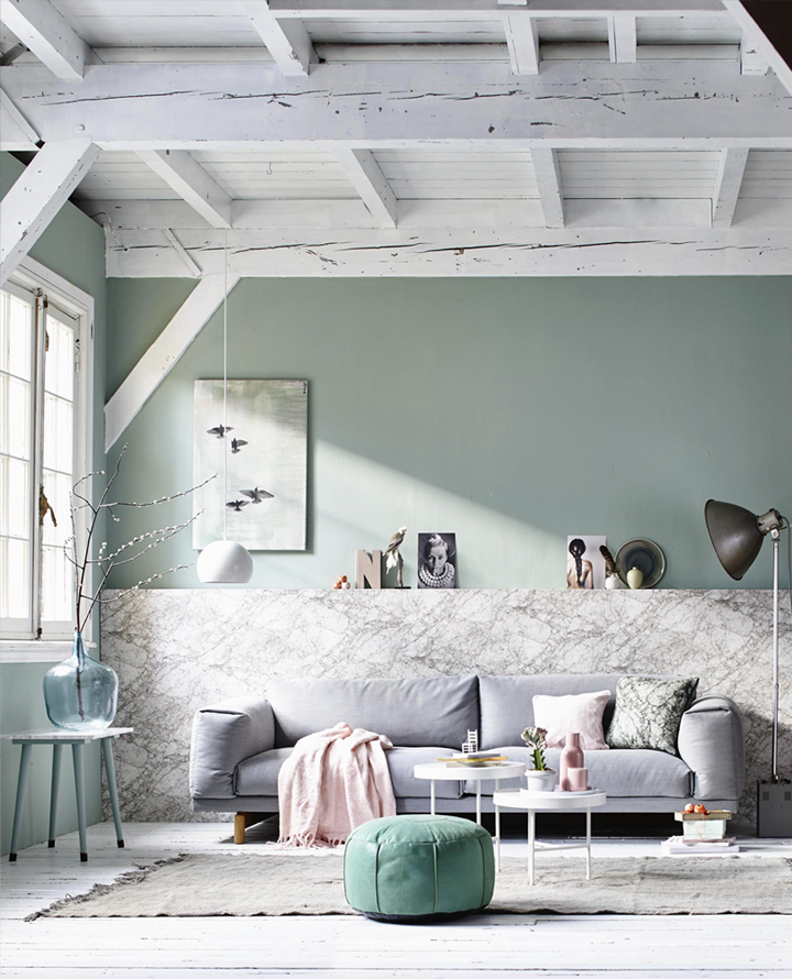
Isn’t it amazing how we change our color preferences according to the season? When winter comes Pinterest and all microblogs start to post pictures in grey, white and brown colors, the dark mood is the most favorite one and the cozy textures fill-in all the feeds. And at the moment when the first signs of the Spring are around us – our eyes want colors. My favorite colors for the spring are pastels and I love the work that the stylist Cleo Scheulderman and the photographer Jeroen van der Spek did for VTwonen.

79ideas_dining_room_spring_inspiration

And if we rely on their taste that’s what will be hot this Spring: it will be the mix of chairs, glass, vintage ladder, pastel colors with hot pink, the marble texture and the beautiful composition of linen in the bedroom that create a feel for luxury.

So do you like that kind of Spring bathed in pastel colors?

79ideas_pastel_spring_inspiration

79ideas_living_room_spring_pastel_inspiration

photographer Jeroen van der Spek / VTwonen

CREATIVE SPACEDECORINSPIRATIONINTERIORSPRING
Share this

The Author radostina

More Posts Like This One

AUTUMN WALK IN PARIS

Tuesday October 30th, 2012

A HOUSE IN OLD ROMANTIC STYLE

Tuesday November 22nd, 2011

HOW THE DESIGNER LIVES OR A BEAUTIFUL HOME IN LONDON

Monday September 1st, 2014

7 Comments

  • Brianna Sullivan
    Thursday March 5th, 2015 05:46 PM

    Yes, I accept. You can come decorate my apartment any time ;) I love these photos, especially the exposed white wood.

    Reply
    • radostina
      Friday March 6th, 2015 06:21 AM

      haha, Brianna, I think you mean you want Cleo Scheulderman to decorate your home. :)))

      Reply
  • Angela
    Thursday March 5th, 2015 11:21 PM

    Totally. I am definitely one of those people who change drastically with seasons! In spring I am obsessed with pastels (I think my new blog design shows that, ha) and then fall rolls around and I am very opposite with the earthy tones and deep shades. I really just love that first photo’s palette though!

    Reply
    • radostina
      Friday March 6th, 2015 06:22 AM

      yes, very nice color combination with textile.
      have a lovely weekend.
      xx

      Reply
  • Anna
    Friday March 6th, 2015 01:48 AM

    love this!! Everything in pastel colors is better <3

    https://aspoonfulofnature.wordpress.com/

    Reply
    • radostina
      Friday March 6th, 2015 06:23 AM

      haha, Anna I think that we all are obsessed with pastels now. :)

      Reply
  • Serena
    Wednesday March 25th, 2015 06:54 AM

    Hi Radostina,
    I’m totally in love with these colors!!
    Thanks for sharing <3
    Serena

    Reply

Leave A Comment Cancel reply

  • ENG
  • БГ

SOCIAL

CATEGORIES

  • ADVICE
  • DESIGN
  • DIY
  • FASHION
  • FOOD
  • HOLIDAY
  • HOME
  • LIFE
  • PERSONAL
  • TRAVEL
  • WEDDING

YOU MIGHT ALSO LIKE

THE CULLEN’S HOUSE

Well …I’m a fan of “Twilight” and this is something that I have to show to you immediately :) Sneak

FRESH APARTMENT IN PALMA, SPAIN

This apartment reminded me for the fresh scent in the morning after a rain. Freshness and spring.  The fantastic patterns of

A PERFECT SUNDAY

This is how I imagine the perfect Sunday – in a cozy bedroom, on a soft bed with countless books

FOUR IDEAS HOW TO BRING VINTAGE MOOD IN YOUR HOME

Few lovely ideas coming from the wonderful magazine “Period Living” grabbed my attention today and I would like to discuss

STRIPES AND OLD WOOD IN THE HOME OFFICE

I have a special feelings for the home office. I spend many hours there and I constantly look for beautiful

1/4

INSTAGRAM

instant film vs. medium format film I thought it instant film vs. medium format film

I thought it will be interesting for you to see the difference. I personally love them both 

#analogue #rfpotw #sanfranciscoweddingphotographer #sanfranciscophotographer #analogonly #fujifilm
photographs without an order from last fall. from photographs without an order from last fall. from the majestic mountains that tower above the waters of lake como to the quaint cobblestone streets that wind through charming hillside towns, every moment in italy felt like a symphony. 

photographed on medium format film with #kodakfilm #lakecomo #luxuryweddingphotographer #refineddesign #quietluxury #filmphotography #contax645
This error message is only visible to WordPress admins
There has been a problem with your Instagram Feed.

ARCHIVE

CATEGORIES

  • ADVICE
  • DESIGN
  • DIY
  • FASHION
  • FOOD
  • HOLIDAY
  • HOME
  • LIFE
  • PERSONAL
  • TRAVEL
  • WEDDING